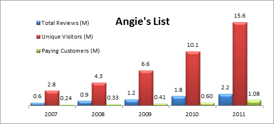
The following graphic shows the trend of user reviews posted on Yelp.com to the number of unique visitors the site received each year from 2007 to 2011. Yelp demonstrated increasingly efficient network effects starting in 2010 and 2011, also the year it went IPO.

Angie’s List has seen more ROI per subscriber and far more paying subscribers than Yelp, primarily due to the “utility” aspect of the website. It gives paying users easy access to service providers and customer reviews. One reason is that Angie’s List customers mostly include individuals surfing the internet looking for reliable service providers, whereas Yelp’s customers are local businesses who have other options to promote their business.
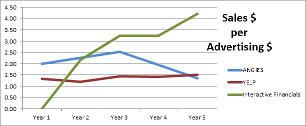
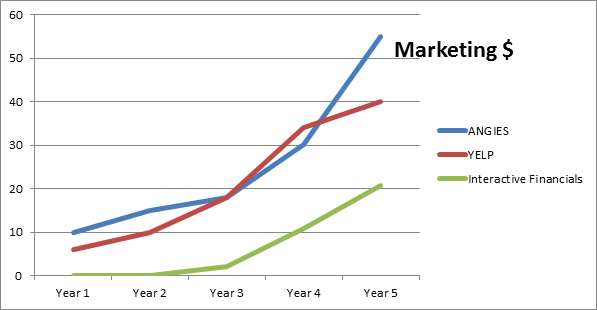
Angie’s List was able to generate $1.95 in sales for each marketing dollar spent whereas Yelp generated $1.41 per marketing $ in 2010. In 2011 the tables turned and Yelp came in with a $1.50 ROI with Angie’s List finishing close with $1.36. It is worth noting that the advertising dollars spent per unique visitor to either website increased by 12% YOY.
The ROI from online advertising expenditures is plotted over a 5-year period for the comparable firms along with Interactive Financial’s projected ROI over the next 5-year period. This chart serves its purpose for comparative purposes only because the market conditions have changed since 2007, and the 2012-2016 timeframe looks to attract more new visitors to “utility” web sites such as Angie’s List (services), Yelp (business reviews) and Interactive Financials (financial data errors).
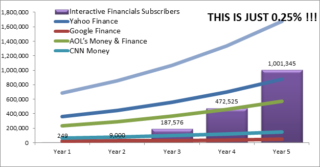
The sales projection for our startup, Interactive Financials, looks attainable given that just 0.25% of the unique visitor population is considered “converted” to paying status.